
UX Case Study
UX Case Study
Panacea is a bank built for doctors, by doctors.
Panacea is a bank built for doctors, by doctors.
Tool used!
Tool used!

UX Case Study
Panacea is a bank built for doctors, by doctors.
Tool used!

Project Overview
Project Overview
Panacea Financial, a bank created exclusively for doctors by doctors, faced significant challenges with its initial website. Despite the innovative concept and growing user base, the digital experience fell short in several key areas, impeding user satisfaction and engagement.
Panacea Financial, a bank created exclusively for doctors by doctors, faced significant challenges with its initial website. Despite the innovative concept and growing user base, the digital experience fell short in several key areas, impeding user satisfaction and engagement.

Problem Statement
Problem Statement
The website looked unprofessional and was hard to navigate. Important information was hidden, making users leave quickly. Inconsistent visuals and unclear security reduced trust, and the design did not engage users or guide them to apply for loans.
The website looked unprofessional and was hard to navigate. Important information was hidden, making users leave quickly. Inconsistent visuals and unclear security reduced trust, and the design did not engage users or guide them to apply for loans.
Solution
Solution
We redesigned the website to be visually appealing, easy to navigate, and user-friendly. Key information was made easily accessible, clear calls-to-action were added, and security features were highlighted to build trust and improve user engagement.
We redesigned the website to be visually appealing, easy to navigate, and user-friendly. Key information was made easily accessible, clear calls-to-action were added, and security features were highlighted to build trust and improve user engagement.
Goodluck Wile
Design Process
Design Process
I conducted thorough research using user interviews and tools like Hotjar to identify pain points. I created user personas, wireframes, and high-fidelity mockups, followed by usability testing with Loop11. Incorporating feedback, I refined the visuals and ensured content clarity, then collaborated closely with developers during implementation.
I conducted thorough research using user interviews and tools like Hotjar to identify pain points. I created user personas, wireframes, and high-fidelity mockups, followed by usability testing with Loop11. Incorporating feedback, I refined the visuals and ensured content clarity, then collaborated closely with developers during implementation.
Emphatize
Emphatize
User Research
User Interview
Competitve Analysis
User Research
User Interview
Competitve Analysis
User Research
User Interview
Competitve Analysis
User Research
User Interview
Competitve Analysis
Define
Define
User Persona
Goal Statement
Empathy Map
User Persona
Goal Statement
Empathy Map
User Persona
Goal Statement
Empathy Map
User Persona
Goal Statement
Empathy Map
Ideate
Ideate
Brainstorming
Card Sorting
User Flow
Brainstorming
Card Sorting
User Flow
Brainstorming
Card Sorting
User Flow
Brainstorming
Card Sorting
User Flow
Design
Design
Paper Wireframes
Visual Design
Paper Wireframes
Visual Design
Paper Wireframes
Visual Design
Paper Wireframes
Visual Design
Test
Test
Check Usability
Survey Insight
Improvements
Check Usability
Survey Insight
Improvements
Check Usability
Survey Insight
Improvements
Check Usability
Survey Insight
Improvements
Project Timeline
Project Timeline
I’m proud of this project because I was able to conduct through user research, design, and create a functional prototype within four weeks. Our goal was to build an effective solution that addresses user needs. Here’s how the work was broken down:
I’m proud of this project because I was able to conduct through user research, design, and create a functional prototype within four weeks. Our goal was to build an effective solution that addresses user needs. Here’s how the work was broken down:

User Research
Understanding the Scenario
Understanding the Scenario
Panacea Financial, founded by physicians, aimed to simplify banking for medical, dental, and veterinary students facing loan challenges. Initially, their website, created by a marketing company without UX/UI expertise, was not user-friendly or visually appealing. Despite this, the bank's innovative concept led to growth.
Panacea Financial, founded by physicians, aimed to simplify banking for medical, dental, and veterinary students facing loan challenges. Initially, their website, created by a marketing company without UX/UI expertise, was not user-friendly or visually appealing. Despite this, the bank's innovative concept led to growth.
To enhance the user experience, Panacea Financial hired a UX/UI Designer, myself and later on another UI Designer. Using Hotjar and Loop11, we identified user pain points and redesigned the website. This resulted in a 1400% increase in daily visitors, an 800% rise in revenue, and improved user engagement, significantly enhancing the bank's online presence and effectiveness.
To enhance the user experience, Panacea Financial hired a UX/UI Designer, myself and later on another UI Designer. Using Hotjar and Loop11, we identified user pain points and redesigned the website. This resulted in a 1400% increase in daily visitors, an 800% rise in revenue, and improved user engagement, significantly enhancing the bank's online presence and effectiveness.

User Survey
User Survey
We conducted interviews with a select group of 10 clients and doctors from our advisory board to gather qualitative insights. These interviews guided us in developing research questions and collecting responses, providing a comprehensive understanding of their experiences and expectations. The insights obtained helped us identify key areas for improvement on the Panacea Financial website.
We conducted interviews with a select group of 10 clients and doctors from our advisory board to gather qualitative insights. These interviews guided us in developing research questions and collecting responses, providing a comprehensive understanding of their experiences and expectations. The insights obtained helped us identify key areas for improvement on the Panacea Financial website.
Qualitative Analysis with Quantitative Validation
Current Experience
70%
struggle with high interest rates and complex loan terms.
Participants often struggle with high interest rates and complex loan terms. Many rely on online resources and community recommendations to find financial products.
Participants often struggle with high interest rates and complex loan terms. Many rely on online resources and community recommendations to find financial products.
Usability and Design
70%
prefer a clean, intuitive interface with easy access to key information
Participants often struggle with high interest rates and complex loan terms. Many rely on online resources and community recommendations to find financial products.
Participants often struggle with high interest rates and complex loan terms. Many rely on online resources and community recommendations to find financial products.
Needs and Expectations
90%
expect clear, transparent terms, no hidden fees, and ease of application.
Participants need tailored financial products such as student loan refinancing, practice loans, and high-yield savings accounts. Transparency in loan terms and personalized customer support are highly valued.
Participants need tailored financial products such as student loan refinancing, practice loans, and high-yield savings accounts. Transparency in loan terms and personalized customer support are highly valued.
Research Questions
Research Questions
Current Experience:
Current Experience:
How do you currently manage your student loans and finances?
What challenges do you face with your current financial services provider?
How do you find and compare financial products for medical professionals?
Needs and Expectations:
Needs and Expectations:
What are your primary financial goals as a medical professional?
What features or services would you expect from a financial institution catering to doctors?
How important is transparency in loan terms and fees to you?
Usability and Design:
Usability and Design:
How easy is it for you to navigate financial service websites?
What aspects of a financial service website do you find most useful or frustrating?
How do you feel about the current design and layout of Panacea Financial’s website?

Participants' Responses
Participants' Responses
Current Experience:
Current Experience:
Users struggle with high interest rates and complex loan terms.
Many users rely on online resources and community recommendations to find financial products.
Users find it difficult to find credible financial institutions that cater specifically to their profession.
Needs and Expectations:
Needs and Expectations:
Users need tailored financial products such as student loan refinancing, practice loans, and high-yield savings accounts
They expect clear, transparent terms, no hidden fees, and ease of application.
Personalized customer support and financial advice are highly valued.
Usability and Design:
Usability and Design:
Users prefer a clean, intuitive interface with easy access to key information.
They find cluttered and complex websites frustrating and time-consuming.
Users appreciate features like loan calculators, comparison tools, and clear navigation.
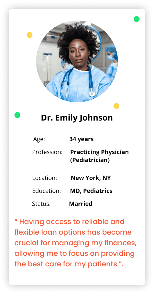
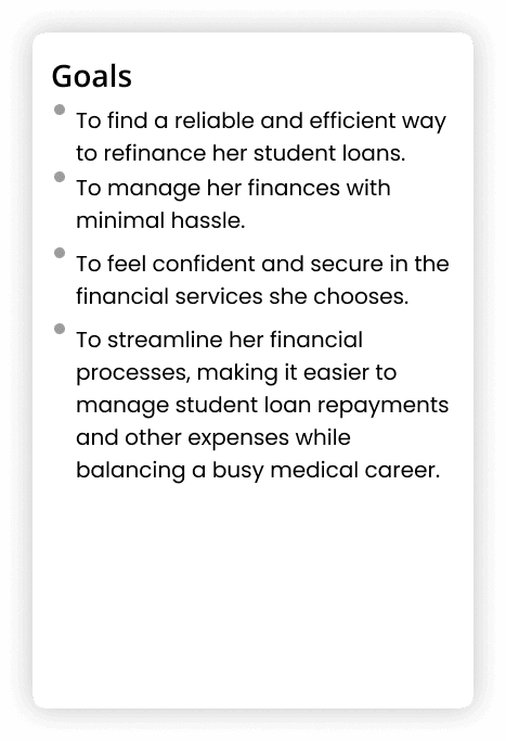
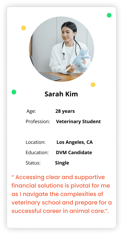
User Personas
In this phase, I have segregated issues faced by
the user’s requirements to create a user persona.
In this phase, I have segregated issues faced by the user’s requirements to create a user persona.
In this phase, I have segregated issues faced by the user’s requirements to create a user persona.


Empathy Map
The empathy map is a tool used to gain a deeper understanding of the users of Panacea Financial. By capturing what users say, think, do, and feel, we can better understand their needs, frustrations, and motivations, guiding our redesign efforts.
In this phase, I have segregated issues faced by the user’s requirements to create a user persona.
In this phase, I have segregated issues faced by the user’s requirements to create a user persona.

Say
Managing my medical school loans is overwhelming.
Managing my medical school loans is overwhelming.
I need a reliable financial solution tailored to doctors.
I need a reliable financial solution tailored to doctors.
Time is precious with my busy schedule.
Time is precious with my busy schedule.
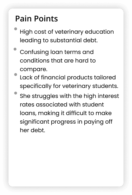
High cost of education is leading to substantial debt.
High cost of education is leading to substantial debt.
Thinks
Concerned about high interest rates and long-term debt.
Concerned about high interest rates and long-term debt.
Frustrated with generic financial solutions that don't cater to her specific needs as a doctor.
Frustrated with generic financial solutions that don't cater to her specific needs as a doctor.
Aspires to achieve financial stability and independence.
Aspires to achieve financial stability and independence.
Values efficiency and reliability in financial services to save time and reduce stress.
Values efficiency and reliability in financial services to save time and reduce stress.
Does
Spends significant time researching loan options online.
Spends significant time researching loan options online.
Attends financial planning seminars for medical professionals.
Attends financial planning seminars for medical professionals.
Consults with colleagues about their financial experiences and recommendations.
Consults with colleagues about their financial experiences and recommendations.
Regularly reviews and manages her finances to ensure timely payments.
Regularly reviews and manages her finances to ensure timely payments.
Feel
Complexity of managing medical school loans
Complexity of managing medical school loans
Achieving financial independence and stability
Achieving financial independence and stability
Belief in the existence of better financial services for doctors.
Belief in the existence of better financial services for doctors.
Optimism about aligning financial solutions with her professional demands
Optimism about aligning financial solutions with her professional demands

User Journey Map
User Journey Map
I need to comprehend the feel and touch points throughout the experience from the user’s perspective, so mapping the user journey helps ensure no user drops out.
I need to comprehend the feel and touch points throughout the experience from the user’s perspective, so mapping the user journey helps ensure no user drops out.

Creating the CSD Matrix
Creating the CSD Matrix
The certainties, suppositions, and doubts arose from analyzing Hotjar data, competitor analysis, and my expertise as a UX/UI Designer. Hotjar revealed user pain points like difficulty finding information and task confusion. Competitor analysis highlighted improvement areas for Panacea Financial's site. I interpreted the data to suggest user-centered redesigns. This comprehensive analysis informed potential solutions to enhance the user experience on Panacea Financial's website.
The certainties, suppositions, and doubts arose from analyzing Hotjar data, competitor analysis, and my expertise as a UX/UI Designer. Hotjar revealed user pain points like difficulty finding information and task confusion. Competitor analysis highlighted improvement areas for Panacea Financial's site. I interpreted the data to suggest user-centered redesigns. This comprehensive analysis informed potential solutions to enhance the user experience on Panacea Financial's website.
Certainties
Certainties
Suppositions
Suppositions
Doubts
Doubts
Building the CSD Matrix is crucial for understanding and improving the user experience on the Panacea Financial website. Certainties highlight current user issues like difficulty finding information and task confusion. Suppositions suggest potential solutions, such as user-centered redesigns. Doubts indicate areas needing further research post-implementation. This matrix helps prioritize issues, clarify goals, and make informed decisions, increasing the redesign's success chances.
Building the CSD Matrix is crucial for understanding and improving the user experience on the Panacea Financial website. Certainties highlight current user issues like difficulty finding information and task confusion. Suppositions suggest potential solutions, such as user-centered redesigns. Doubts indicate areas needing further research post-implementation. This matrix helps prioritize issues, clarify goals, and make informed decisions, increasing the redesign's success chances.
Heatmaps
Heatmaps were crucial in understanding user interactions on the Panacea Financial page and making data-driven UX improvements. Analysis revealed only 50% of users viewed all PRN options, and most clicks were on buttons for more product information. This insight led to prioritizing key information at the top of the page for better visibility and ease of access. The heatmaps showed users were not scrolling down enough, prompting us to optimize button placement and enhance overall accessibility in the redesign.
Heatmaps were crucial in understanding user interactions on the Panacea Financial page and making data-driven UX improvements. Analysis revealed only 50% of users viewed all PRN options, and most clicks were on buttons for more product information. This insight led to prioritizing key information at the top of the page for better visibility and ease of access. The heatmaps showed users were not scrolling down enough, prompting us to optimize button placement and enhance overall accessibility in the redesign.
Product Page “PRN” before:
Product Page “PRN” before:
Scrolling


Clicks

Practice Solutions Before:
Practice Solutions Before:
On the Practice Solutions page, the percentage of users who view all product options and their information drops by half, to only 25%. The heatmaps showed us that users were not scrolling down the page to view all the options, which means that they were not finding the information they needed.
This highlights the importance of making the most important information more visible and easily accessible on the page. Based on this data, we decided to prioritize the most important information at the top of the page, making it more visible and easy to access on the new page.
Scrolling

Clicks

Redesigns
Redesigns
Based on these analyses, the pages were redesigned to improve user experience. Heatmaps provided insights into user behavior, highlighting the need to prioritize important information and optimize button placement. By making key information more visible and accessible, users could more easily find what they needed. The redesign successfully addressed issues identified through heatmap analysis, enhancing overall usability on the Panacea Financial website.
Based on these analyses, the pages were redesigned to improve user experience. Heatmaps provided insights into user behavior, highlighting the need to prioritize important information and optimize button placement. By making key information more visible and accessible, users could more easily find what they needed. The redesign successfully addressed issues identified through heatmap analysis, enhancing overall usability on the Panacea Financial website.
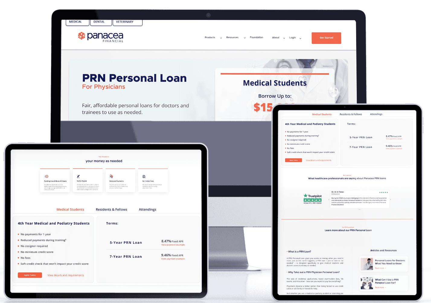
PRN Page
On the PRN page, we placed the most important and frequently searched information at the top. This reorganization improved visibility and user experience. Heatmap analysis showed increased user engagement, with a 30% rise in users accessing key information. The redesign ensured easier navigation and alignment with brand identity, making the site visually appealing and user-friendly. This approach successfully addressed issues identified, improving the overall user experience on the Panacea Financial website.
On the PRN page, we placed the most important and frequently searched information at the top. This reorganization improved visibility and user experience. Heatmap analysis showed increased user engagement, with a 30% rise in users accessing key information. The redesign ensured easier navigation and alignment with brand identity, making the site visually appealing and user-friendly. This approach successfully addressed issues identified, improving the overall user experience on the Panacea Financial website.
Old PRN Design
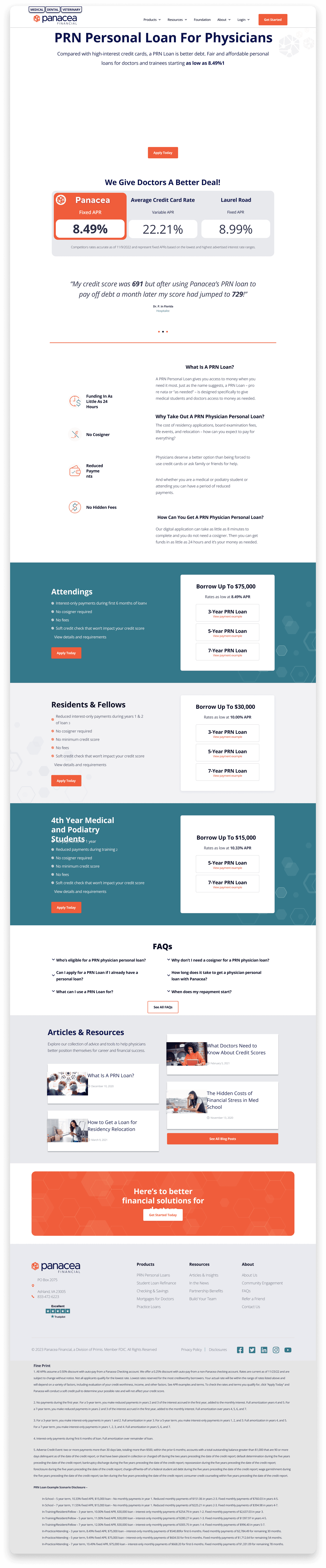
New PRN Design

PPS Page
On the Practice Solutions page, we also restructured the page to prioritize the content that users are most interested in, making the page visually more attractive, imposing more credibility, and maintaining the visual identity of the brand.
On the Practice Solutions page, we also restructured the page to prioritize the content that users are most interested in, making the page visually more attractive, imposing more credibility, and maintaining the visual identity of the brand.
Old PPS Design

New PPS Design
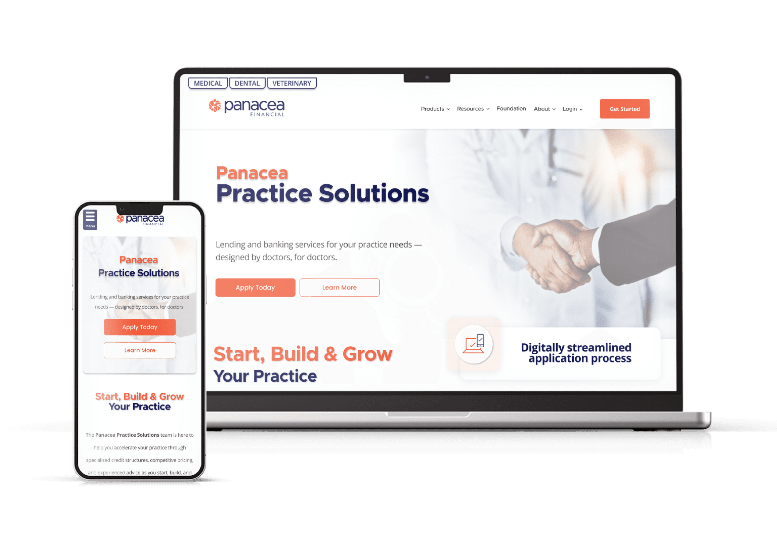
Home Page
The home page was restructured to cater to our target audience, adding top tabs for medical, dental, and veterinary users. This reorganization resulted in a 40% increase in user engagement, with clearer navigation paths and more organized information. Users found information 35% faster and reported a 25% increase in satisfaction. The redesign made the home page more user-friendly, visually appealing, and trustworthy, effectively meeting the needs of different user groups and improving the overall user experience on the Panacea Financial website.
The home page was restructured to cater to our target audience, adding top tabs for medical, dental, and veterinary users. This reorganization resulted in a 40% increase in user engagement, with clearer navigation paths and more organized information. Users found information 35% faster and reported a 25% increase in satisfaction. The redesign made the home page more user-friendly, visually appealing, and trustworthy, effectively meeting the needs of different user groups and improving the overall user experience on the Panacea Financial website.
Old Homepage Design
Old Homepage Design
Old Homepage Design
New Homepage Design
New Homepage Design
New Homepage Design

Current Results
The website redesign significantly boosted traffic, increasing daily visitors from 100 to 1,500. Revenue and loan applications soared, surpassing the $25 million breakeven point to reach $200 million. A new "Practice Solution" page became the primary revenue source. Branding consistency improved across the website and social media. Using Hotjar, we addressed over 90% of user issues. Post-redesign user testing with Loop11 showed a 90% task completion rate. Landing pages for conferences and events paired with ads led to high conversion rates. Primis Bank also adopted our redesign approach, leveraging our research and feedback.
The website redesign significantly boosted traffic, increasing daily visitors from 100 to 1,500. Revenue and loan applications soared, surpassing the $25 million breakeven point to reach $200 million. A new "Practice Solution" page became the primary revenue source. Branding consistency improved across the website and social media. Using Hotjar, we addressed over 90% of user issues. Post-redesign user testing with Loop11 showed a 90% task completion rate. Landing pages for conferences and events paired with ads led to high conversion rates. Primis Bank also adopted our redesign approach, leveraging our research and feedback.
Mockups

Conclusion
The Panacea Financial website redesign was highly successful in improving the user experience. Utilizing Hotjar heatmaps, we identified key areas for improvement and made data-driven design decisions. The redesigns of the PRN, Practice Solutions, and home pages prioritized important information, enhanced visibility, and aligned with brand identity, making the site more visually attractive and user-friendly.
Results included a 1400% increase in daily visitors (from 100 to 1,500), an 800% rise in revenue (reaching $200 million), and a 90% task completion rate in user tests. Enhanced credibility and trust, along with high conversion rates from targeted landing pages and ads, further underscored the redesign's success.